
The Ohio Education Policy Institute (OEPI) has been analyzing Ohio’s Report Card data since 2013. This brief report contains initial analysis of selected elements of the FY21-22 school year Report Card.
Table 1 provides a summary of the average Performance Index (PI) score for districts in each of the 8 typology groups identified by the Ohio Department of Education (ODE). The Performance Index is an overall summary measure of the performance of students on the state’s battery of 22 tests administered to students from 3rd grade through high school. The Performance Index takes into account the performance of each student on each test, with more points awarded for students that score higher on the various tests than do those who score lower.
Table 1 shows the average PI score for districts in each typology group for school years FY19, FY21 and FY22. (Ohio’s state assessments were not administered in FY20 because of the closure of schools due to the COVID-19 pandemic.) Table 1 is organized to show the typology groups in descending order according to their average PI score in FY19.
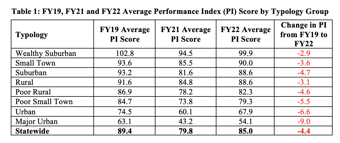
There are several findings from the data shown in Table 1:
· In each of the 3 years shown, Major Urban, Urban, Poor Small Town and Poor Rural districts have the lowest average PI scores.
· Average PI scores in each of the 8 Typology groups declined from FY19 to FY21.
· Average PI scores in each of the 8 Typology groups increased from FY21 to FY22
· From FY19 to FY22, the Major Urban and Urban school districts exhibit the largest decline in average PI score.
· Wealthy Suburban and Rural school districts exhibit the smallest average decline in PI scores From FY19 to FY22.
Table 2 shows the change in average PI score by typology group from FY19 to FY21 and then from FY21 to FY22. Table 2 is organized to show the Typology groups organized from smallest average increase in PI to largest average increase from FY21 to FY22.
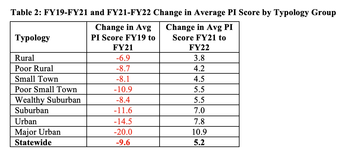
Figure 1 below provides a graphic depiction of the same data as that shown in Table 2. Figure 1 makes it easier to see that the increases in the average PI scores from FY21 to FY22 tend to mirror the decreases in the average PI scores from FY19 to FY21. Another way to say this is that the districts whose scores decreased the least from FY19 to FY21 also showed the smallest increase from FY21 to FY22, while the districts whose scores fell the most in FY21 also rebounded the most in FY22.
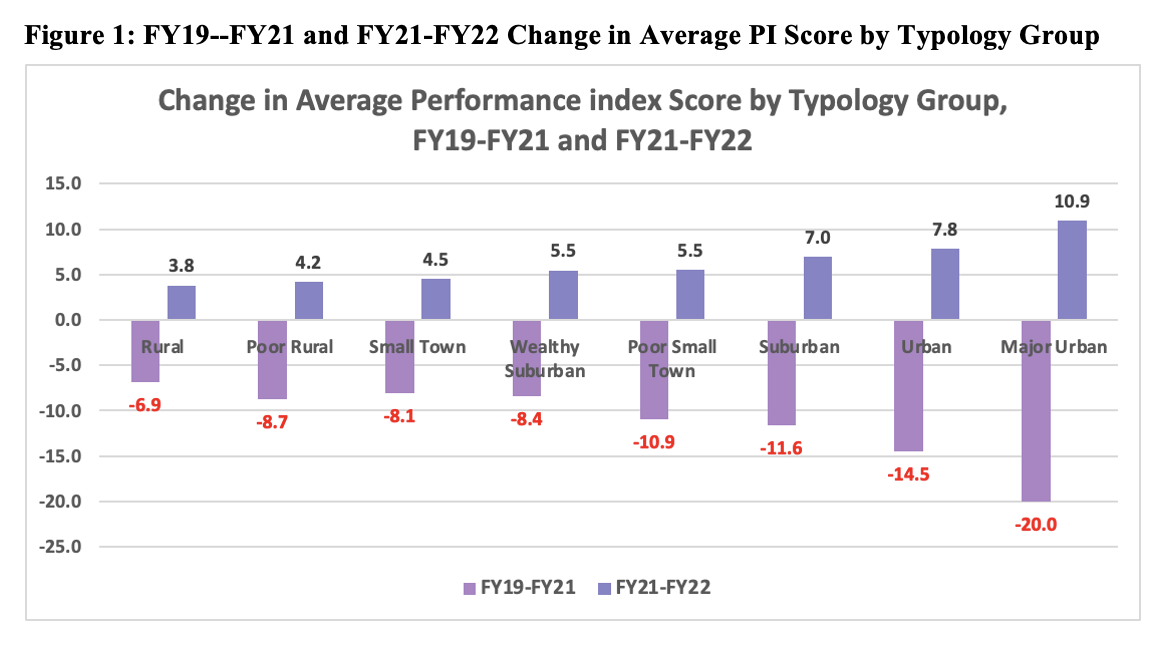
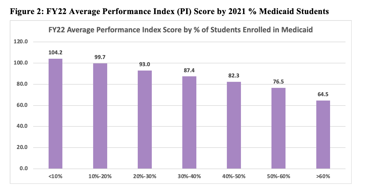
Table 3 provides a comparison of the average PI score in Ohio school districts according to the percentage of students who were enrolled in Medicaid in FY21 (note that FY22 Medicaid is not yet available from ODE). Children are eligible for Medicaid in Ohio if their family income is at or below 200% of the Federal Poverty Level (FPL). In 2021, the Federal Poverty level for a family of 4 was $26,500 so 200% of the FPL for a family of four equaled $53,000.
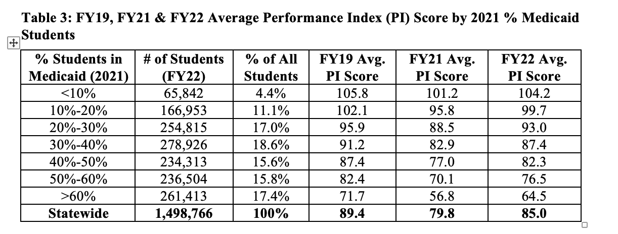
The data in Table 3 clearly shows that the school districts with the lowest percentage of students in Medicaid have the highest average PI scores, while the districts with the highest percentage of students enrolled in Medicaid have the lowest average PI scores. This pattern is apparent in FY19, FY21 and FY22. In fact, this pattern has been apparent in every year that OEPI has analyzed Ohio’s Report Card data. This negative correlation between economic status and student performance was first shown in the landmark Coleman Report in 1966.
Figure 2 shows the FY22 data from Table 3 in graphic form.
Chronic Absenteeism
A student is considered chronically absent if they miss more than 10% of instructional time for either excused or unexcused reasons. As an obvious first step towards learning is for a student to actually be in school, it is not a surprise that a large body of research has established that chronic absenteeism is one of the primary causes of low academic achievement.
Table 4 below shows the percentage of students that were chronically absent by ODE Typology group for both FY19 and FY22. The table is organized by the FY19 chronic absentee rate for FY19 from low to high. In FY19, urban school districts had a chronic absentee rate 16.6 percentage points greater than that of wealthy suburban school districts while the 8 major urban districts had a chronic absentee rate 26.9 percentage points above the wealthy suburban district rate.
By FY22, this gap had only widened. The chronic absentee rate drastically increased for all typology groups, roughly doubling for wealthy suburban, rural, small town, suburban, poor rural, and poor small towns. And while the urban and major urban chronic absentee rates did not quite double, they increased by a larger amount than was the case in any of the other typologies. As a result, in FY22 the chronic absentee rate on urban districts was now 26.3 percentage points higher than that of the wealthy suburban districts while the major urban chronic absentee rate was 42.1 percentage points higher than the rate in wealthy suburban districts.
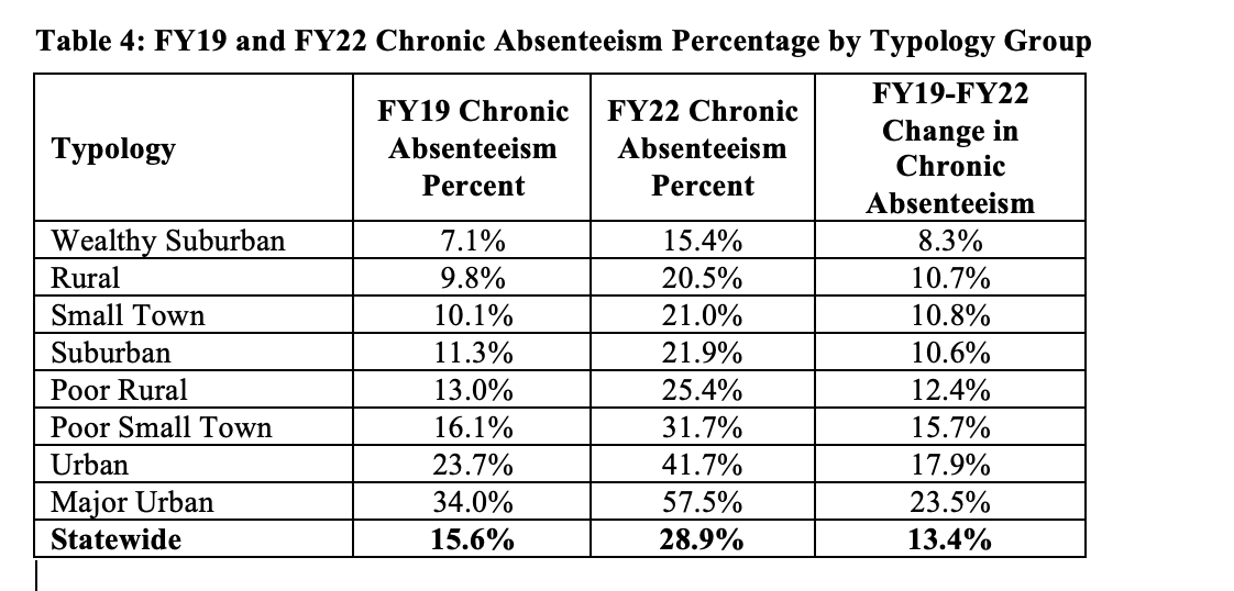
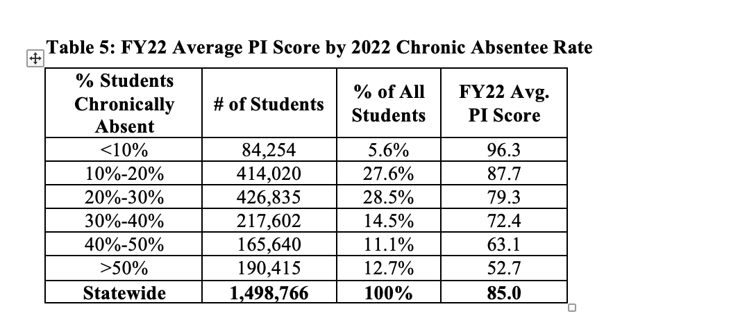
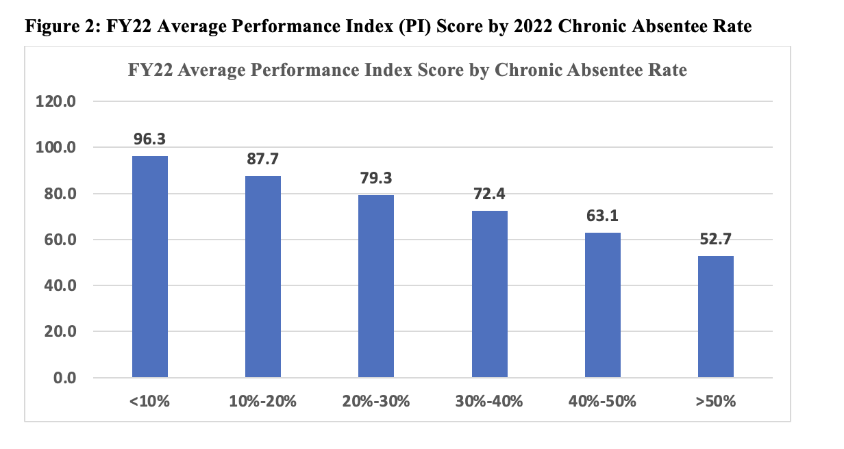
Table 5 provides a comparison of the average PI score in districts according to the FY22 chronic absentee rate. Districts where the chronic absentee rate is less than 10% have an average PI score of 96.3 and the PI score steadily decreases as the chronic absentee rate increases. Districts with a chronic absentee rate of greater than 50% have an average PI score of only 52.7.
The data in Table 5 is also shown graphically in Figure 2.
Conclusions
The FY22 Report Card analysis summarized above leads to the following primary findings:
1) The average Performance Index (PI) score in each of the 8 ODE district typology groups declined from FY19 to FY21 and then increased from FY21 to FY22.
2) The districts whose PI scores decreased the least from FY19 to FY21 also showed the smallest increase from FY21 to FY22, while the districts whose scores fell the most in FY21 also rebounded the most in FY22.
3) The average PI score in each of the 8 typology groups is lower in FY22 than in FY19.
4) There is strong direct correlation between the socioeconomic status of students and the Performance Index metric. School districts with the lowest percentage of students in families eligible for Medicaid have the highest average PI scores, while the districts with the highest percentage of students enrolled in Medicaid have the lowest average PI scores.
5) This strong negative correlation between economic status and student performance has been apparent in every year that OEPI has analyzed Ohio’s Report Card data and has been well-known since the landmark Coleman Report was released in 1966.
6) Chronic Absenteeism in Ohio has increased significantly since the onset of the COVID-19 pandemic in spring 2020. The statewide chronic absenteeism rate in Ohio has nearly doubled from 15.6% of students in FY19 to 28.9% of students in FY22.
7) Chronic absenteeism is also strongly correlated with socioeconomics, as the districts with higher parentages of low-income students also tend to have higher chronic absenteeism rates. The average chronic absenteeism rates by ODE typology group are highest in the Poor Rural, Poor Small Town, Urban and Major Urban typology groups.
8) The gap in chronic absenteeism rates among the different district typology groups in Ohio has widened since FY19. The increases in chronic absenteeism from FY19 to FY22 are highest int eh typology groups that already had the highest absenteeism rates in FY19.
9) Unsurprisingly, chronic absenteeism is also strongly negatively correlated with student achievement. Districts where the chronic absentee rate is less than 10% have an average PI score of 96.3 and the PI score steadily decreases as the chronic absentee rate increases. Districts with a chronic absentee rate of greater than 50% have an average PI score of only 52.7.